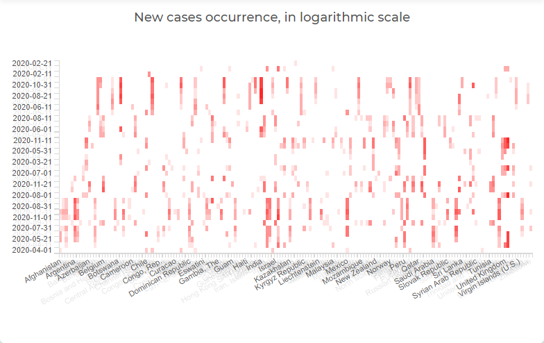
Heat map chart is mostly similar to a regular table chart that uses colors to represent values or ranges of values. The colors may differ in hue or brightness showing how the values are clustered together or scattered.
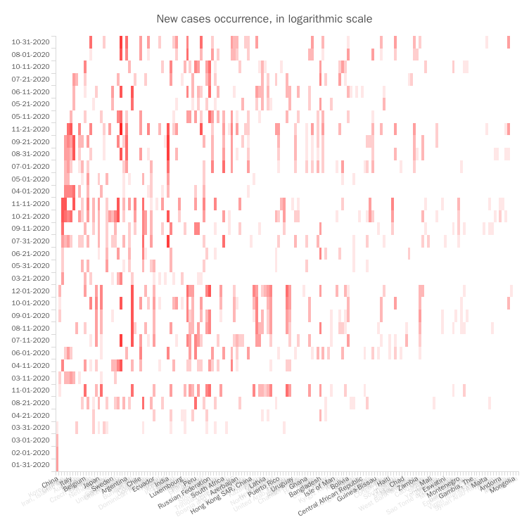
Heat map chart is mostly similar to a regular table chart that uses colors to represent values or ranges of values. The colors may differ in hue or brightness showing how the values are clustered together or scattered.